UX Research, UX/UI Design
Q-Life Employee
Redesigning a workplace mental health and well-being platform for a new audience
Company
JackHabbit Inc.
Sector
Health and Wellness, B2B2C
My Role
Research Lead, UX/UI Designer
Year
2023
Project Background
The Challenge
Our company had previously launched a mental health and wellness platform for post-secondary students. We wanted to expand this success into the workplace market. To make a new version of the platform resonate with a larger employee demographic, we needed insight into employees’ diverse needs and use contexts.
The Approach
We set out with two goals that would impact most of the app’s features and interactions:
- Compile a list of recommendations to improve usability and appeal
- Adapt the current user experience (UX) to meet the diverse needs and contexts of a new employee audience
Because of our project’s unique starting point, I structured our strategy as a customized version of the design thinking process. The project phases were:
-
Research
-
Test the current application with our new audience
-
Empathize with their unique needs and contexts
-
- Define and communicate our findings and opportunities
- Ideate design solutions
- Prototype new designs
I chose tools and methods that would deliver the types of insights we could leverage while working within our time and budget constraints.

Icons: Flaticon.com
The project's customized process: Test and Empathize, Define, Ideate, Design and Prototype
My Role
My responsibilities included:
- Creating our UX research strategy
- Conducting research
- Processing and analyzing the data
- Presenting findings to stakeholders
- Collaborating with development and leadership on solutions feasibility
- Redesigning the user interface to improve usability and engagement
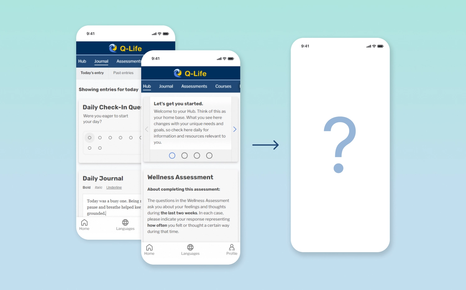
The Q-Life platform before redesign
Research
Creating a UX Research Plan
To inform our approach, I began by asking:
-
What relevant data do we already have?
-
What new data do we need?
-
What resources can we leverage and what are our constraints?
Our team had feedback from a previous user survey conducted with our student demographic. This gave us some general usability insights. Now, we needed insights specific to an employee demographic with its diverse needs and use contexts. Given our limited time, I opted for a more qualitative approach using the following research methods:
-
Contextual inquiry (i.e., observing people use the app as they naturally would in everyday life)
-
Usability testing
-
1:1 Interviews
-
Initial and closing surveys
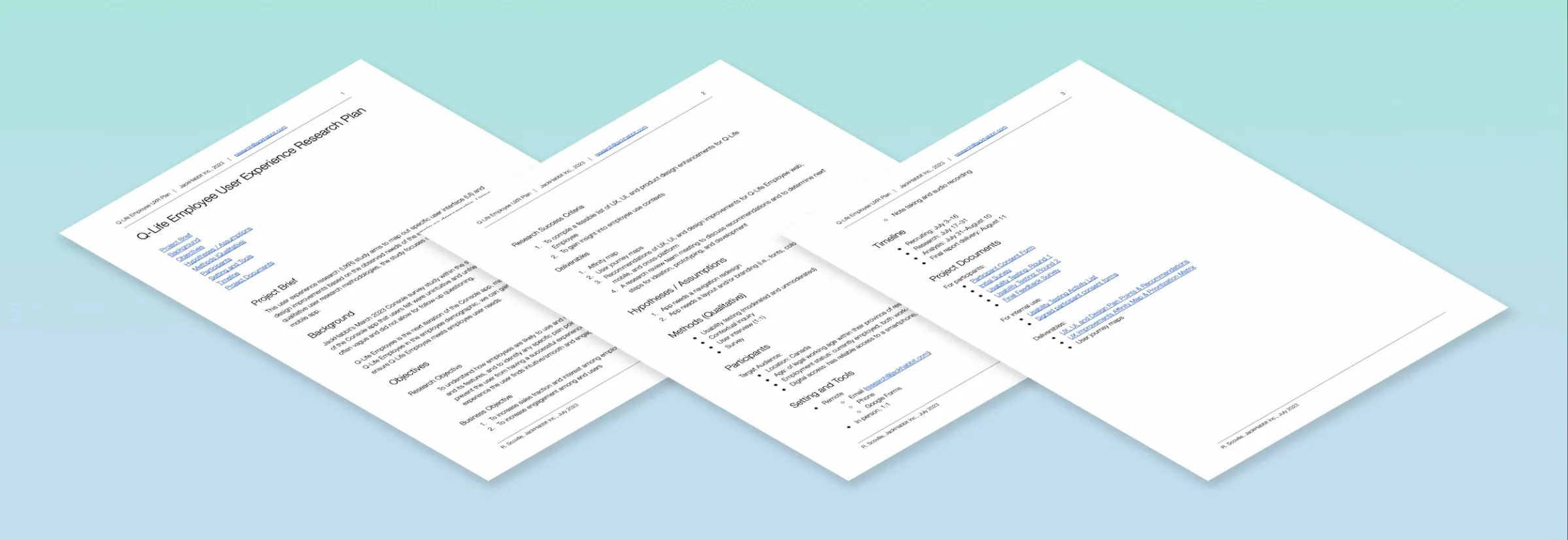
The User Experience Research Plan
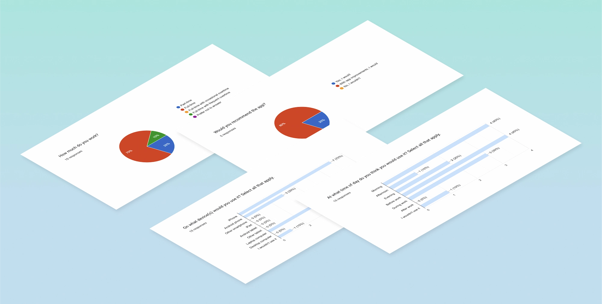
A few survey questions and answers
Contextual Inquiry:
Observing Application Use Within Everyday Contexts
In an application use experience, what we say and what we do can sometimes differ significantly. To supplement the limitations of self-reporting with observational data, I conducted observation sessions with 3 of our 15 testers. These were people employed in varied jobs including remote office work, on-site labour, and customer service.
I observed each person doing a set of prompted tasks on our platform in which they interacted with each area and feature. Some of these tasks included logging a journal entry, completing a daily check-in, and progressing through educational content.
I kept an audio recording going, so participants could talk through their actions at a natural, uninterrupted pace. These contextual observations gave us helpful, sometimes surprising insights.
Usability Testing
I conducted moderated usability testing with 3 of our testers and collected unmoderated usabilty testing with the remaining testers. To do this, I gave tasks to each tester, followed by questions about their experience. I based these questions on Jakob Nielsen’s 10 Usability Heuristics for user interface (UI) design. With this focus and mixed-moderation reporting, we were able to get a more thorough view of our UI's usability.
Notably, the moderated group gave us some unexpected insights. For instance, I observed the interface become confusing to a couple participants as they completed a specific task. However, when the participants eventually completed it, they expressed a positive perception and forgot about their earlier frustrations or confusions.
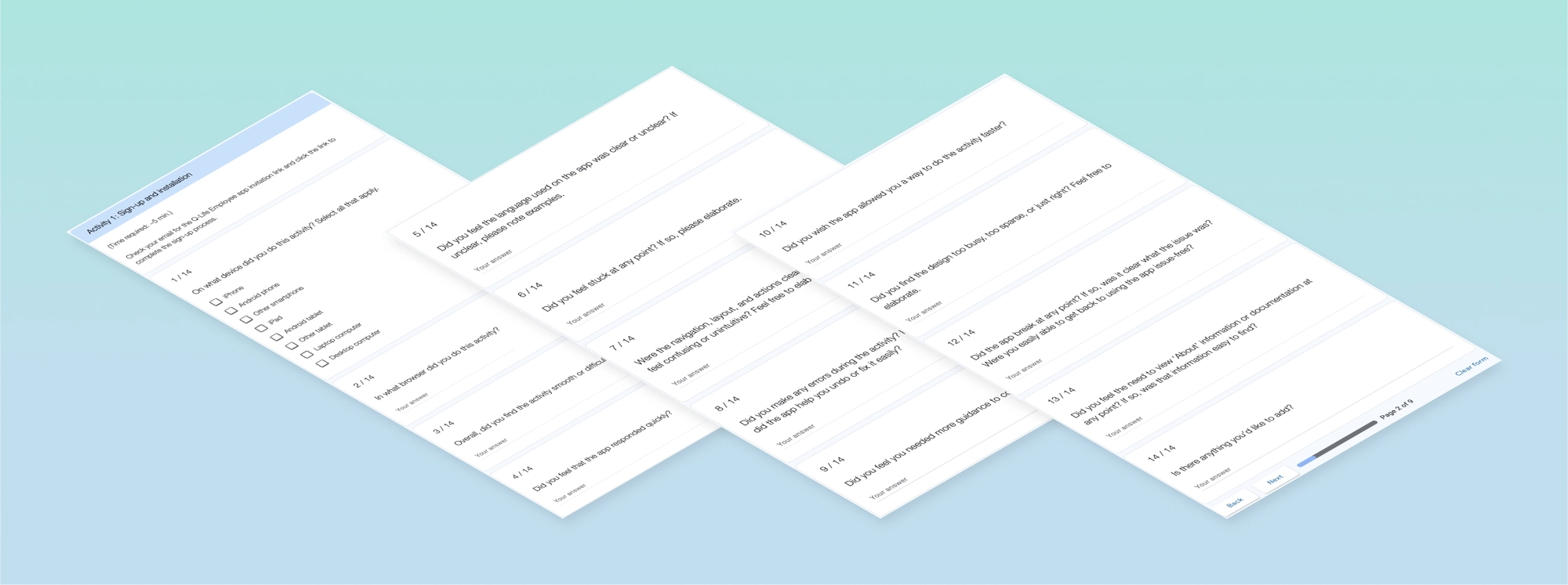
Usability testing: a task prompt and follow-up questions
Defining Research Findings
Identifying Feedback Themes
We had prior usability data from a student survey, and now had data from our employee group as well. It was time to look at the data and synthesize it into actionable items that told us clear stories about our audience's needs. Using the data, I compiled a thematic analysis. This method told us which issues were most common and which were outliers, which features were most used and appreciated, etc.
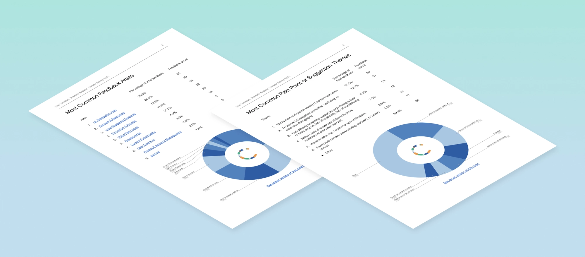
A sample of the thematic analysis compiled from survey data
Mapping Pain Points and Opportunities
With the newly gathered usability testing data, I could begin looking at patterns and answering overarching questions:
-
What were the successes, pain points, and themes here?
- How might we leverage this data to enhance our platform in the most efficient way?
To answer these questions, I created an affinity diagram. This involved separating out the data points and grouping these by area, task flow, and pain point.
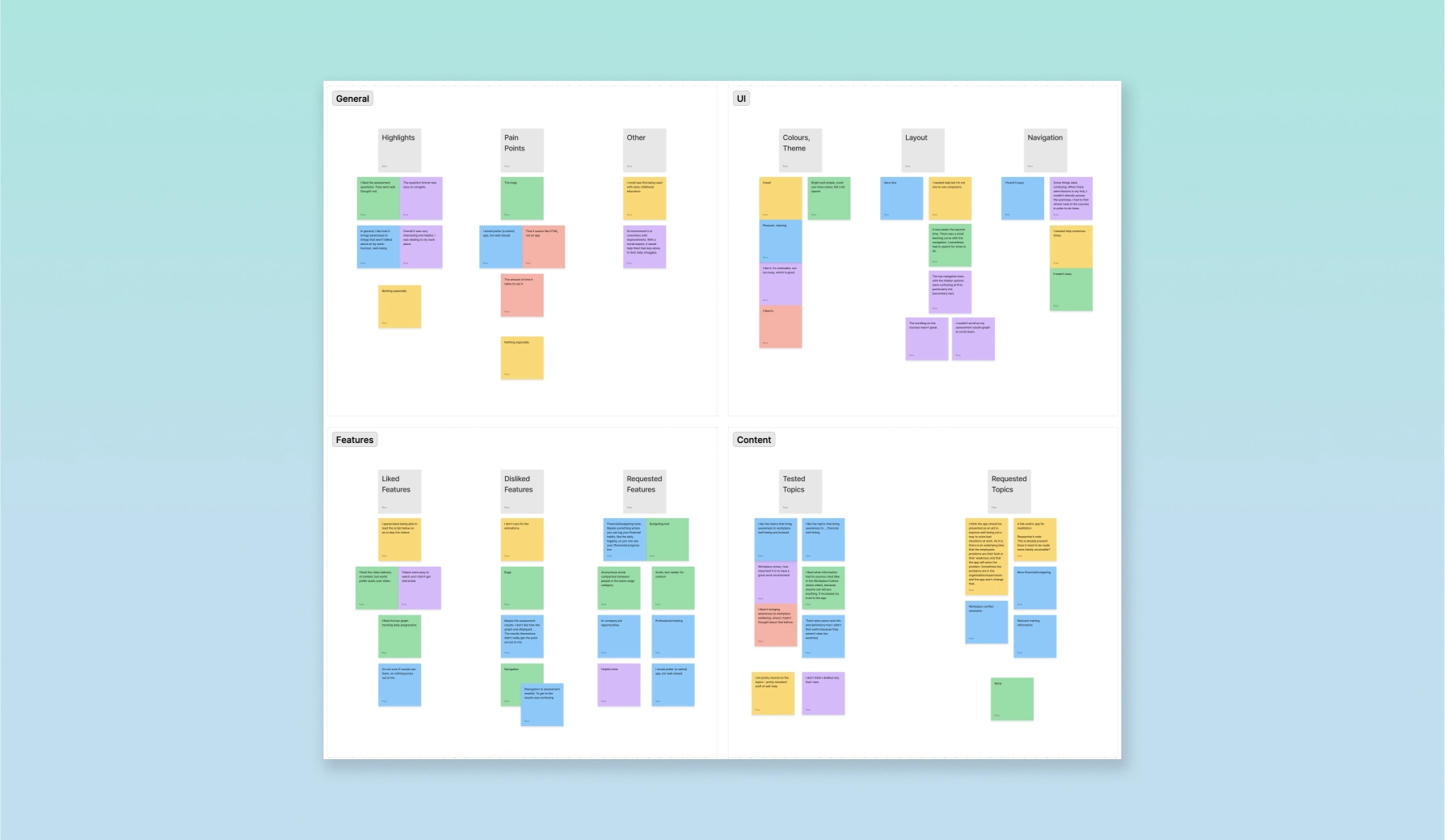
An affinity diagram organizing data points into application areas and common feedback items
Ideation
Communicating Findings and Recommendations
I organized our pain points and recommended solutions into a report, which I shared with our Development Lead to get her ideas and feedback. Her expertise with front-end development and accessibility gave us a valuable, added perspective into development feasibility and accessibility enhancements.
We then presented the finalized Pain Points and Recommendations Report to the wider team. Communicating our findings in a concise, solutions-oriented way empowered our team to engage with the data, empathize with our audience, and ideate new opportunities.
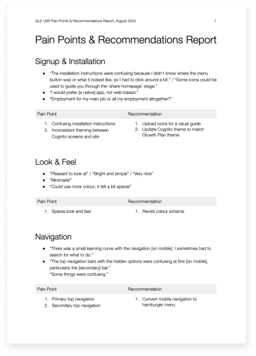
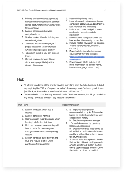
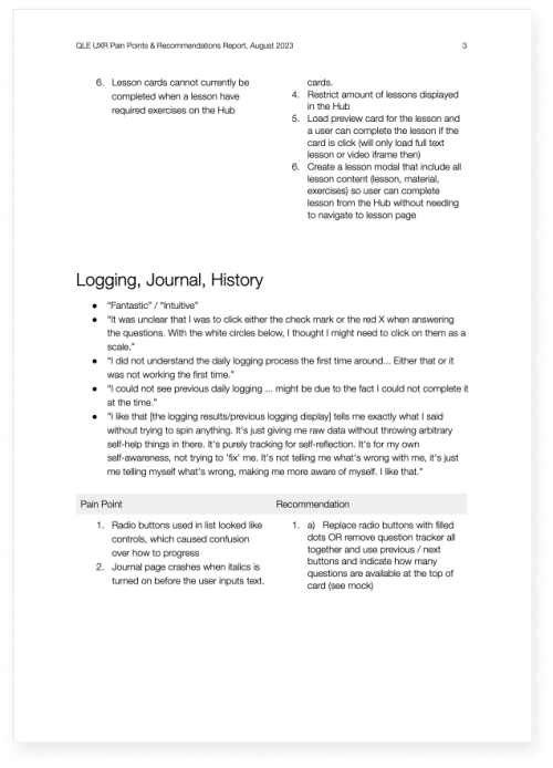
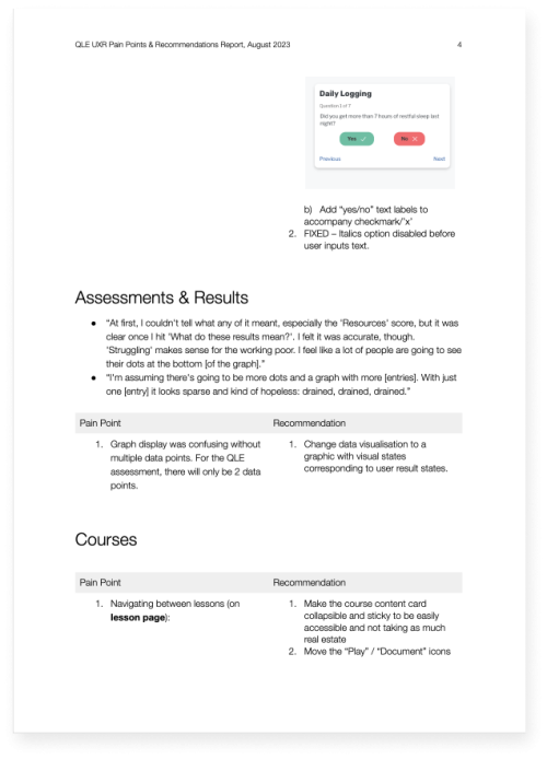
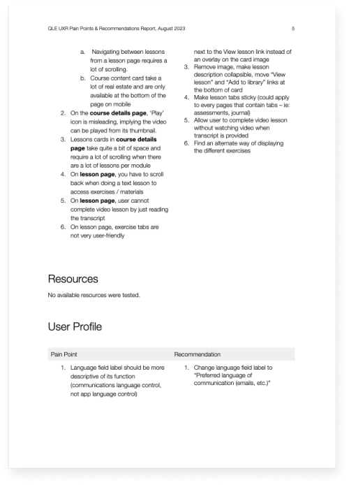
Pain Points and Recommendations Report
Prioritizing Solutions
Our development team then met to finalize the next steps in our design and development strategy. We reviewed and prioritized improvements within an impact-effort matrix, brainstorming adjustments as needed. This method enabled us to see at a glance which enhancements would require what level of effort and which would have the maximum impact for our platform users.
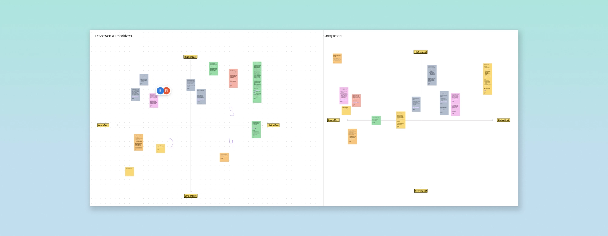
A teamwide prioritization whiteboarding session using an Impact-Effort Matrix
Design
Before
— Horizontal web navigation hides some menu items, requiring the user to swipe to view more.
— A non-collapsible menu unnecessarily takes up valuable screen space.
After
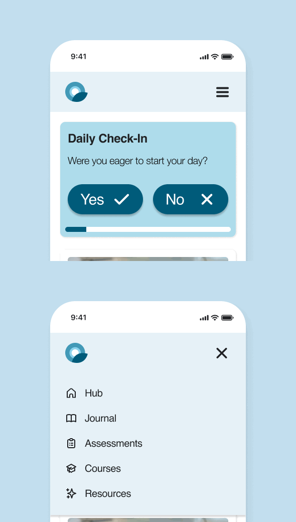
— The familiar hamburger menu on mobile reduces work for the user and makes all options visible at once.
— The collapsible menu frees up valuable screen space on smaller mobile screens.
Lesson Card Redesign
Before
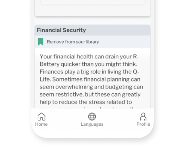
— Large blocks of text with no visuals can feel overwhelming for some people. This also reduces scannability.
After
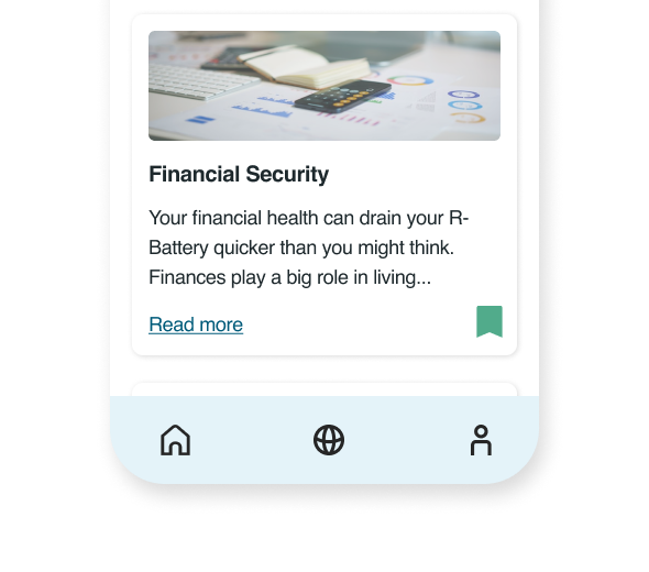
— Hiding text overflow in an expandable card breaks up the text block while still allowing readers to expand for further reading.
— Adding relevant graphics to each lesson card adds visual interest and improves scannability.
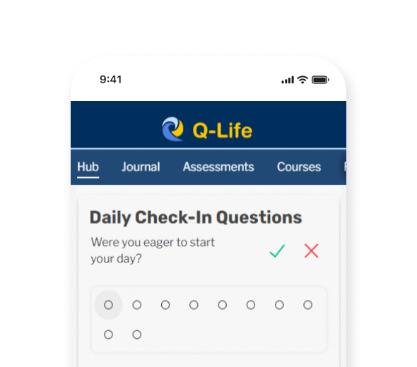
Check-In Card Redesign
Before

— Usability testing revealed that the small "✓" / "✗" answer controls were sometimes interpreted by users as "right"/"wrong". This can be confusing to some.
— The dot progression too closely resembles radio buttons, which can also cause some confusion about their functionality.
After
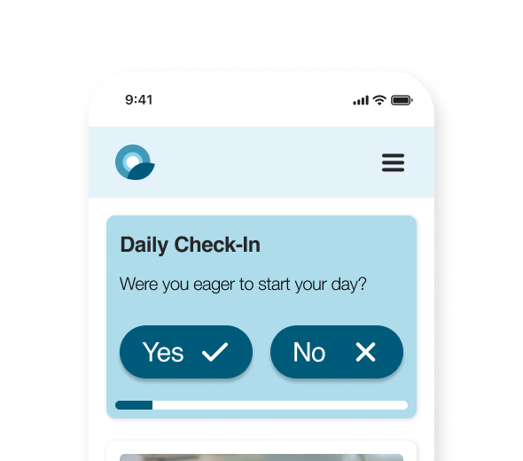
— Larger, labeled answer controls improves clarity and clickability on mobile screens.
— Using a simpler progression bar improves clarity and saves valuable mobile screen space.
Results
Project Successes
14
Platform enhancements implemented
32
Usability improvements
recommended
1
Platform redesign ready to prototype for a new audience
Hub
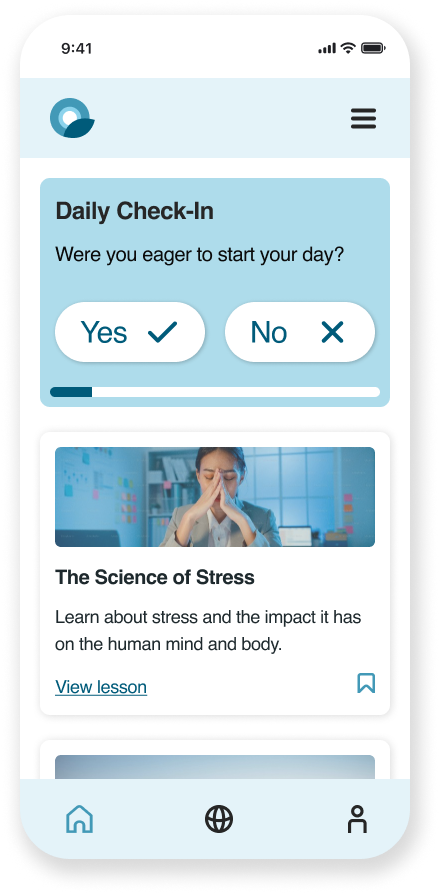
Journal
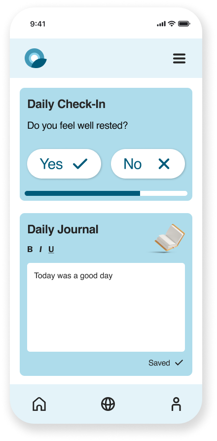
Resources
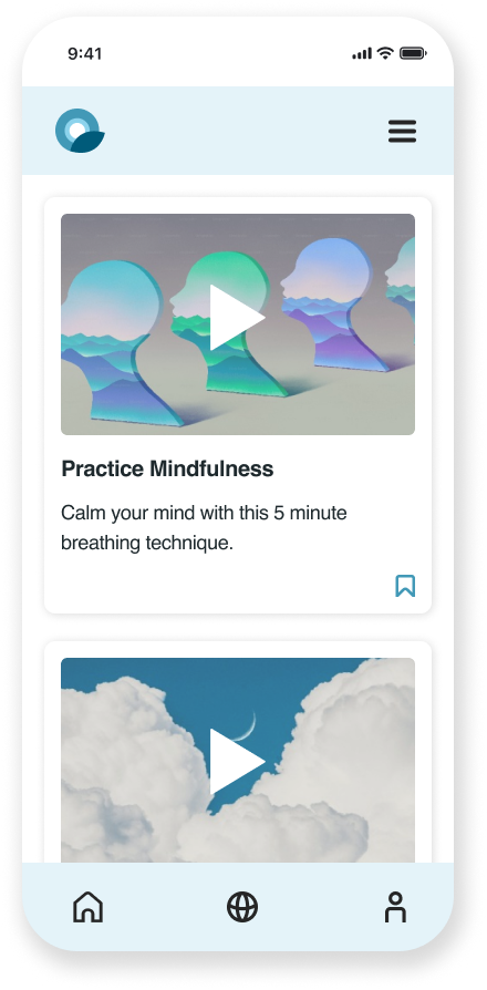
Assessments
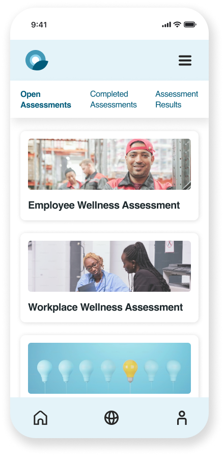
Courses
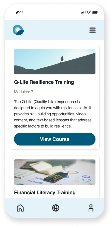
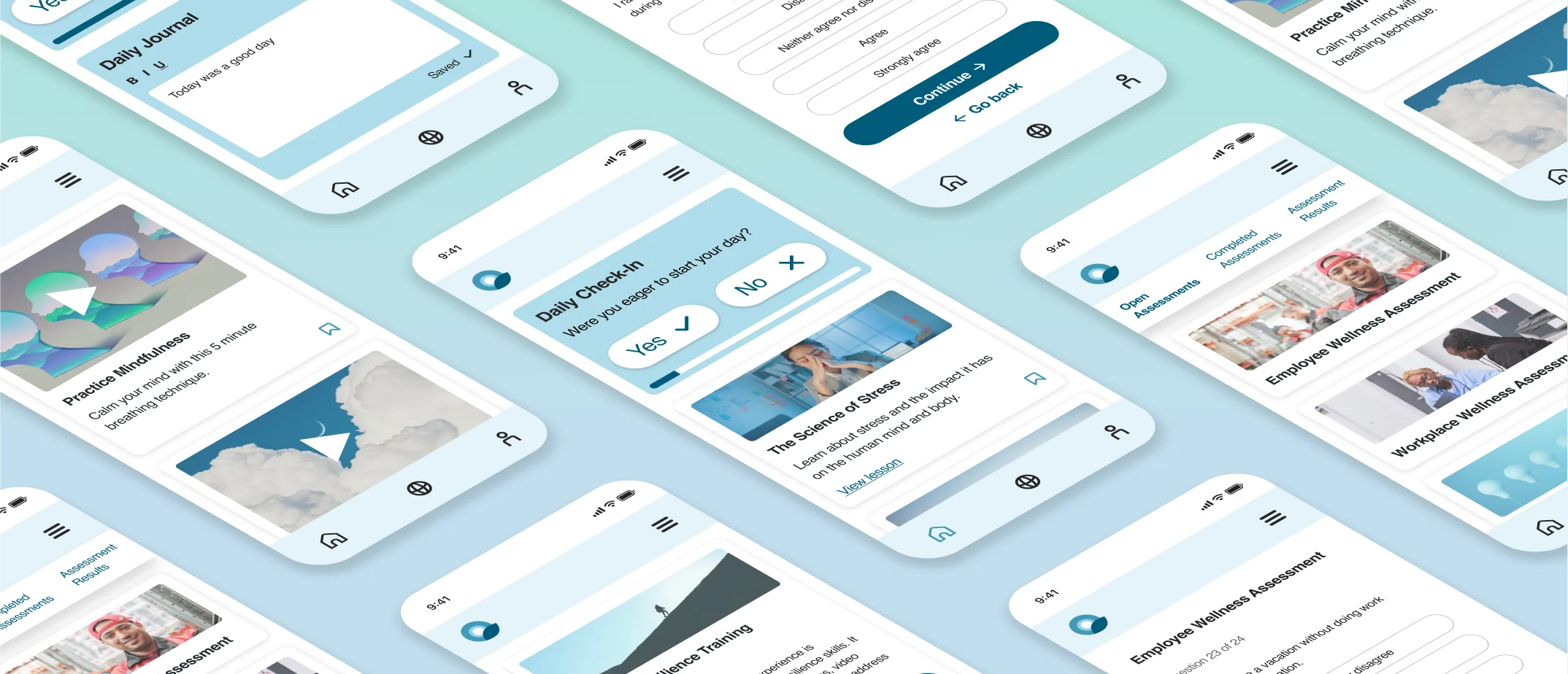
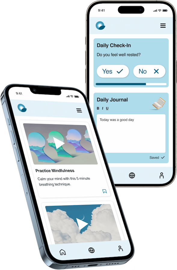
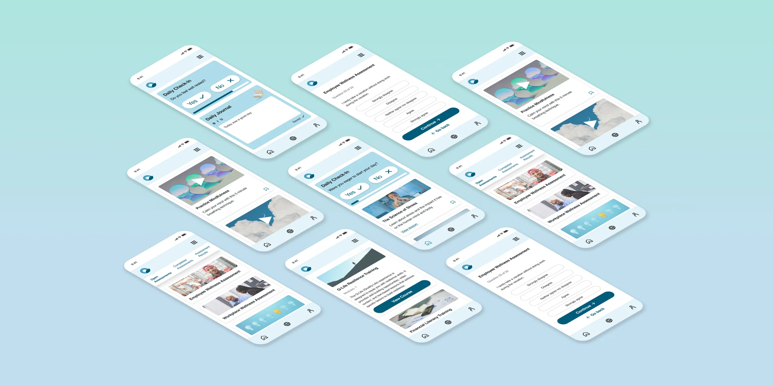
Redesigned screens
Reflections
Highlights
What went especially well?
Unexpected insights
Observing and talking with our audience as they used the platform helped challenge my expectations. I had insider knowledge on how the UI was supposed to work, so it was a great learning experience uncovering unexpected use cases.
Team-wide collaboration
Collaborating closely with our team’s lead developers in the ideation and prioritization phases allowed our solutions to reflect our development capabilities. This also leveraged our team's diverse expertise in back-end and accessibility.
Takeaways
What lessons will I apply to future projects?
Explore new tools for quantitative research
I am now exploring new third-party research tools that enable teams to accomplish broader quantitative research goals on tight timelines and budgets.
Ensure higher unmoderated tester completion rate
With busy lives, people understandably cannot always complete unmoderated testing. In the future, I would better anticipate this by:
- Broadening our tester pool (this can be accomplished with secure third-party tools)
- Better incentivizing testing completion (as company budget allows)
- Creating a testing experience that lets unmoderated testers choose which tasks to complete and allows them to opt for only short tasks if needed
Next Steps
How would I iteratively build on this project?
-
Continue with implementation and iterative testing
-
Create a platform onboarding experience
- Create a branded design system for this new product
